Margin And Padding
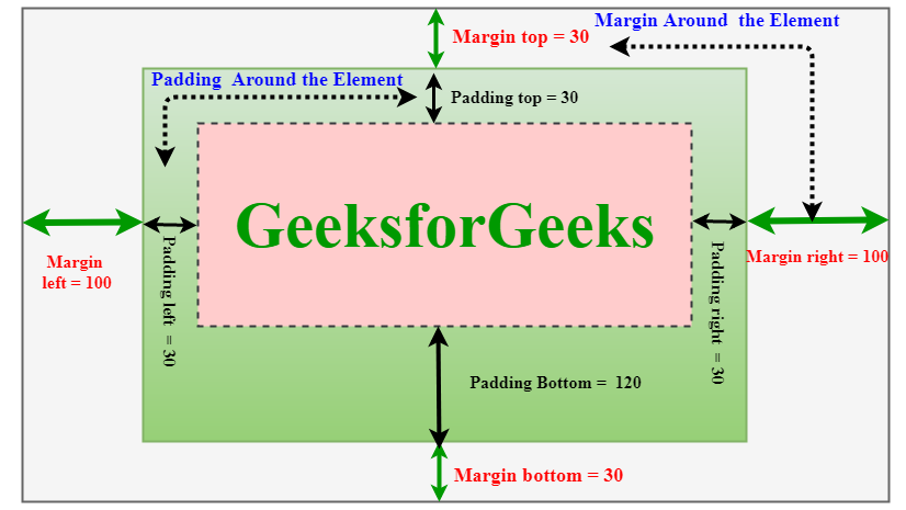
In CSS, margin and padding are two important properties used to add space around and within elements, respectively.
 Above image is referenced from GeeksforGeeks
Margin refers to the space between an element and its neighboring elements, while padding refers to the space between an element and its content. Some examples of how to use these properties:
/* Set a margin of 10 pixels on all sides of a div element */
div {
  margin: 10px;
}

/* Set different margin values for each side of an element */
div {
  margin-top: 10px;
  margin-right: 20px;
  margin-bottom: 30px;
  margin-left: 40px;
}

/* Set a padding of 20 pixels on all sides of a paragraph element */
p {
  padding: 20px;
}

/* Set different padding values for each side of an element */
p {
  padding-top: 10px;
  padding-right: 20px;
  padding-bottom: 30px;
  padding-left: 40px;
}
In the first example, the margin property is used to add a margin of 10 pixels around all sides of a div element.
In the second example, the margin-* properties are used to set different margin values for each side of the div element.
In the third example, the padding property is used to add a padding of 20 pixels around all sides of a p element.
In the fourth example, the padding-* properties are used to set different padding values for each side of the p element.
Grid Layout
CSS grid layout is a powerful way to create two-dimensional layouts in CSS. It allows you to define rows and columns of grid cells, and then place content within those cells. Here are some ways to create grids in CSS:
Using the display: grid property: This is the most common way to create a grid layout in CSS. You can define the grid using the grid-template-rows and grid-template-columns properties, and then place content within the grid using the grid-row and grid-column properties.
.grid-container {
  display: grid;
  grid-template-columns: 1fr 1fr 1fr;
  grid-template-rows: 100px 200px;
}

.grid-item {
  background-color: #ccc;
  padding: 20px;
}

.item-1 {
  grid-row: 1 / 3;
  grid-column: 1 / 2;
}

.item-2 {
  grid-row: 1 / 2;
  grid-column: 2 / 4;
}

.item-3 {
  grid-row: 2 / 3;
  grid-column: 2 / 3;
}
In this example, we define a grid container with three columns and two rows. We then define three grid items and place them within the grid using the grid-row and grid-column properties.
Using the flexbox property: Flexbox is another way to create a grid layout in CSS. You can define a flex container with the display: flex property and then use the flex-basis property to define the width of each grid item.
.grid-container {
  display: flex;
  flex-wrap: wrap;
}

.grid-item {
  flex-basis: 33.33%;
  box-sizing: border-box;
  padding: 10px;
}
In this example, we define a flex container with the display: flex property and wrap the items using the flex-wrap property. We then define each item with a flex-basis of 33.33%.
Overall, CSS grid layout is a powerful tool for creating complex layouts in CSS. You can use the display: grid property, the float property, or the flexbox property to create grids in CSS.